
10 Tips for Getting Better Results from Claude Design
Learn the process-driven approach to getting better results from Claude Design. These 10 tips cover everything from setting up design systems and providing context, to mocking up versions, using the right editing tools, and thinking about component reuse from the start.

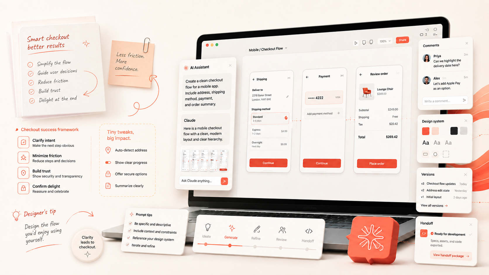
AI design tools are getting very good at producing something impressive from a short prompt.
That can also be misleading.
The first result is rarely where the real value is. The biggest gains come from how you set up the project, structure prompts, iterate, and use the model to critique its own work.
After spending time with Claude Design, I found a few patterns that consistently produced better results. These aren't really "prompt hacks." They're closer to workflow habits.
Here are the ones I'd use again.
1. Start With the Design System and Format
If you're working on anything that needs to feel remotely production-adjacent, set up the design system before you start generating screens.
Claude Design can work from an existing organizational design system, import one, derive styles from an existing site, or help create one from scratch. You can also start with a pre-built system if speed matters more than exact brand fidelity.
This has a bigger impact than simply making the UI prettier.
Without a design system, the model has to invent:
- typography
- colors
- spacing
- components
- button styles
- form patterns
- card treatments
- interaction conventions
That's a lot of decisions you probably don't want it making independently.
This is also where I would establish the format of the product. Tell Claude up front whether you're designing for mobile, web, or a fully responsive experience, and what that should mean across different screen sizes.
Core UX states should be part of that foundation, too. Empty, loading, error, disabled, and success states aren't polish to add later. They should be treated as first principles and handled consistently from the beginning.
With those rules in place, you can spend your prompts on the product itself, instead of repeatedly correcting foundational decisions.
The more complete the system is, the better the output tends to be.
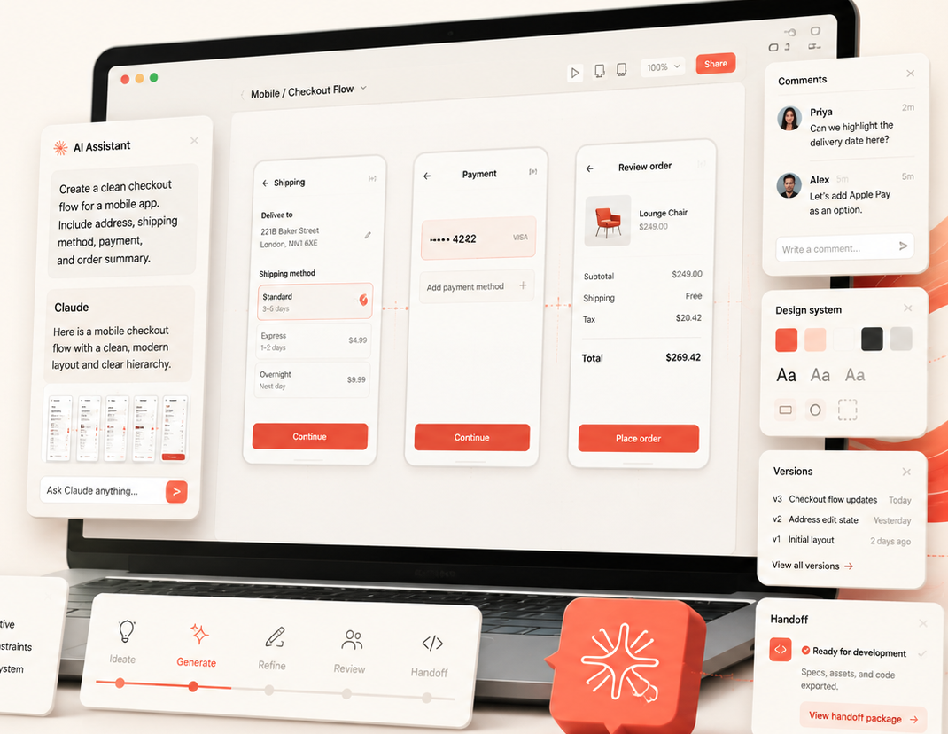
2. Don't Jump Straight Into “Build This”
One of the easiest mistakes is starting with a vague prompt like:
Build me a scheduling app.
It may work, but you're handing a lot of product decisions to the model.
A better move is to ask Claude to help create the design prompt first.
For example:
Here are my requirements. Turn them into a design prompt. Identify anything that's ambiguous and ask clarifying questions before designing.
This gives Claude a chance to reason about the problem before it starts drawing UI.
A strong design prompt usually includes four things:
- Goal: What are you building?
- Audience: Who is using it?
- Content: What information needs to appear?
- Layout: How should that information be organized?
You don't have to perfectly specify all by yourself. Give Claude the context you have and let it help uncover what's missing.
3. Let It Ask Questions
If Claude stops to clarify something before it starts building, that's usually a good sign.
Let it.
Questions about roles, priorities, user flows, devices, or edge cases are often exactly the questions that would otherwise surface later in design review or development.
This is one of the more useful side effects of AI prototyping. A written requirements document can look complete while still leaving a surprising amount open to interpretation. Turning those requirements into an interface exposes ambiguity very quickly.
That makes Claude Design useful not just for creating prototypes, but also for testing whether the underlying product idea is actually well-defined.
4. Start Simple, Then Layer
Large prompts are tempting because Claude can handle a lot of context.
That doesn't mean you should ask it to solve everything at once.
How much you break things up depends on the size and complexity of the requirements. For a smaller feature, one prompt may be enough. For a larger product or feature set, I've had better results working in phases, usually one module or user flow at a time:
- Start with the primary user flow or module.
- Make sure the core layout and realistic content are working.
- Add the interactions and secondary paths within that module.
- Review the full flow and refine it before moving on.
- Then repeat the same process for the next module.
The design system, responsive behavior, accessibility expectations, and core states like empty, loading, and error should already be established up front. Again, those aren't things to layer in at the end.
Working this way makes it much easier to see where the design starts to drift. It also gives you cleaner checkpoints. If something goes wrong, you're fixing one part of the product instead of untangling a giant generation.
The same thing applies to feedback.
Don't combine ten unrelated requests into one prompt if you can avoid it. Make one meaningful change, look at the result, then keep going. It also tends to work better if you let Claude finish what it's doing before piling on the next request.
5. Mock Up a Few Directions Before You Polish
One of the biggest advantages of AI-assisted design is that exploring alternatives is cheap.
Use that.
Before spending several rounds polishing one direction, ask Claude to mock up a few versions first. This can be for a full page or just a section of a page.
For example:
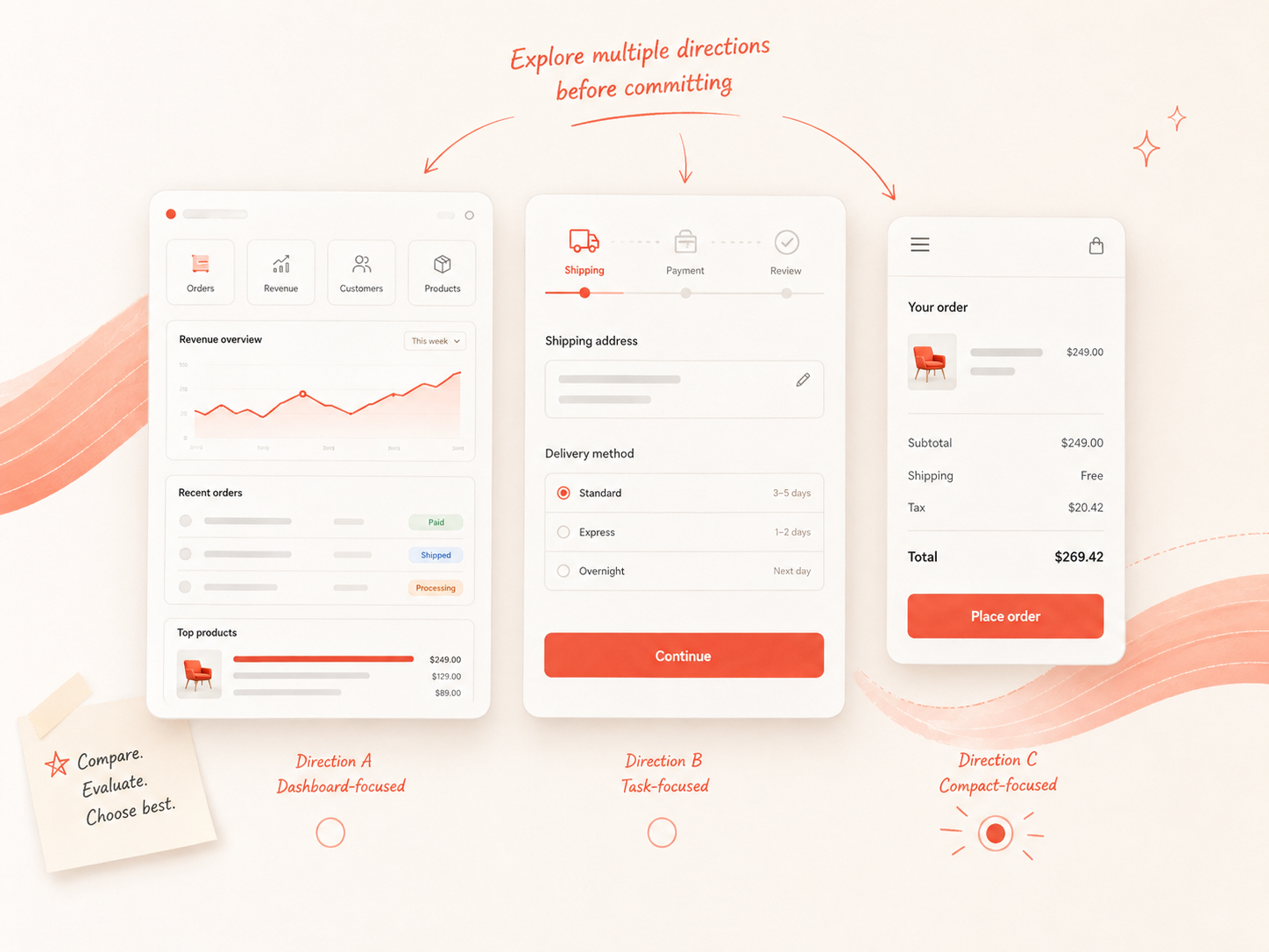
Mock up three different versions of this page so I can compare the overall structure before we implement one.
Mock up a few versions of this section so I can compare layout and hierarchy before we implement one.
Mock up a few approaches to this module - one task-focused, one dashboard-focused, and one more compact.
This is especially useful when you're still figuring out the information architecture, hierarchy, or interaction pattern.
The goal isn't to fully build three versions. It's to get enough of each direction to compare them, pick what works, and then move into implementation.
That's usually better than committing to the first idea and then spending several prompts trying to rework it. It gives you a faster way to compare ideas before you spend time refining one direction.
6. Use the Right Kind of Editing
Claude Design gives you a few different ways to make changes, and they're useful for different things.
Use chat for broader changes across a page or user flow:
Make this page feel more task-focused and reduce the emphasis on reporting.
Use comments when you want to focus Claude on a specific part of the page. You can select an element or draw around an area, then give feedback just on that section.
For example:
Show me a few different mockups for this header.
Make this section more colorful and easier to scan.
Rework this card area so the most important action is more obvious.
Comments are useful because you can be specific about where you want Claude to focus without having to describe the whole page.
Use inline editing when you know the exact HTML-level change you want to make.
That can be text:
Change this label to “View details.”
Or styling and spacing:
Change the gap between these elements to 12px.
Make this heading 24px and reduce the bottom margin.
Make this button full width.
Inline editing is especially useful for small, precise changes where you don't need Claude to rethink the design.
Clear, specific feedback still matters. It just makes it easier to get to the result you want with fewer rounds of back-and-forth.
7. Ask Claude to Review Its Own Work
This may be the most useful habit in the entire workflow.
Once the prototype starts to come together, have Claude review it for gaps before you move on. I'd do two kinds of reviews.
First, review the design itself.
Review this product for UX gaps.
Identify inconsistent interaction patterns.
Find missing states and edge cases.
Review the design for accessibility and hierarchy issues.
Pretend you're a first-time user and tell me where you would get confused.
Then, review it against the original requirements.
This is the part I'd make sure not to skip.
Give Claude the original requirements again and ask it to compare them directly against the current design:
Compare the current prototype against the original requirements and identify anything that is missing, incomplete, or represented differently than expected.
That gives you a much more useful review than just asking whether the design “looks good.”
Before implementing anything, review Claude's feedback yourself. Remove the suggestions you don't agree with, refine anything that needs more context, and narrow it down to the gaps you actually want to fix.
You can keep working through the review with Claude until it reflects the changes you agree are worth making. Then, simply tell Claude to implement the design review.
8. Save Versions and Reset When Needed
Claude Design doesn't have the same kind of version history or one-click rollback you may be used to in other design tools. So before making a bigger change, I like to explicitly tell Claude to save the current version first.
For example:
Save this version before we try a different direction.
Keep this version, then try a new approach to the header.
This is useful for larger layout changes, navigation changes, or anytime you're experimenting with a page or section you already like.
It's also worth doing regularly as the project gets larger so you have checkpoints you can return to without losing progress.
And if Claude gets stuck on a direction, don't keep fighting the same prompt forever.
If it keeps misunderstanding the same thing, try:
- going back to the last good version
- simplifying or restating the request
- starting a new chat with cleaner context
- switching models for something more complex
Sometimes branching from a version you like is the better move. Other times, a clean reset is faster than trying to correct the same misunderstanding over and over.
The important part is having a version you can return to before you start experimenting.
9. Use Claude Design for More Than the Prototype
Claude Design is useful for more than building product UI.
You can also use it to create things around the product, like:
- presentation decks
- diagrams
- product narratives
- one-pagers
- workflow visuals
- reports
- internal documentation
It can also be useful for sharing the work itself. If someone can't easily open the project or you just want a faster way to walk people through it, you can ask Claude to create a walkthrough of the design.
For example:
Create a narrated walkthrough of this prototype that explains the main user flows and key decisions.
You can also ask for subtitles or text narration so the walkthrough still works without audio. That gives you another way to share the design with stakeholders without requiring them to click through the full project themselves.
So even if the main thing you're building is a prototype, Claude Design can also help with a lot of the supporting artifacts around it.
10. Plan for Handoff Early
If you're building in Claude Design, the assumption should be that the work is eventually going to production.
That means handoff shouldn't be something you think about only at the very end.
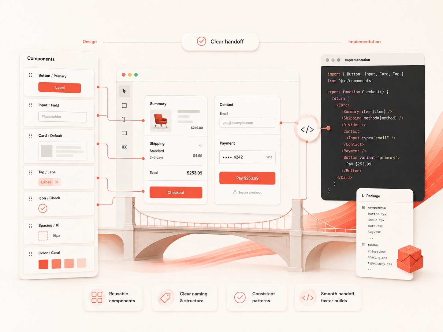
Claude already carries the design system through the project, so you don't need to keep restating it. What you can do is make the structure easier to carry forward.
For example, tell Claude to:
- reuse existing components instead of creating near-duplicates
- name components clearly
- use the same component for repeated patterns
- keep interactions consistent across similar areas
- avoid one-off solutions when an existing pattern already works
- align component names with the components that already exist in your codebase when possible
That last one can make the transition into implementation much easier. If your project already has components like PrimaryButton, Card, or DataTable, using those same names in the prototype creates a clearer bridge between the design and the code.
As the project grows, that consistency matters more.
The cleaner and more familiar the component structure is in the prototype, the easier it is to understand what should be reused when the design moves into implementation.
The goal is to make the handoff feel like a continuation of the work, not a restart.
The Short Version
If you're experimenting with Claude Design, I'd start here:
- Set up the design system, product format, and core UX rules first.
- Give Claude context before asking it to build.
- Let it ask clarifying questions.
- Work through the product one module or user flow at a time.
- Mock up a few versions of pages or sections before committing to a direction.
- Use chat for broad changes, comments for scoped feedback, and inline editing for precise HTML changes.
- Ask for a design review, compare it against the original requirements, refine the review, and then implement it.
- Save versions regularly, especially before changing direction, and reset when Claude gets stuck.
- Use Claude Design for supporting artifacts and walkthroughs too.
- Reuse and name components in a way that makes the handoff into the existing codebase easier.
Getting better results from Claude Design is mostly about the process around the prompt. Most of the improvements I’ve seen have come from being more intentional about how the work moves from idea to design to implementation.
Good luck and happy designing!